Flexbox is the way in which the parts of web page elements are arranged or laid out. It facilitates to align elements and distribute space within the container (box). Flexbox makes it easier to design flexible responsive layout structure without using float or positioning.
It’s the planning and designing process from we understand how the layout of website should look like. And to make it align we can use flexbox.
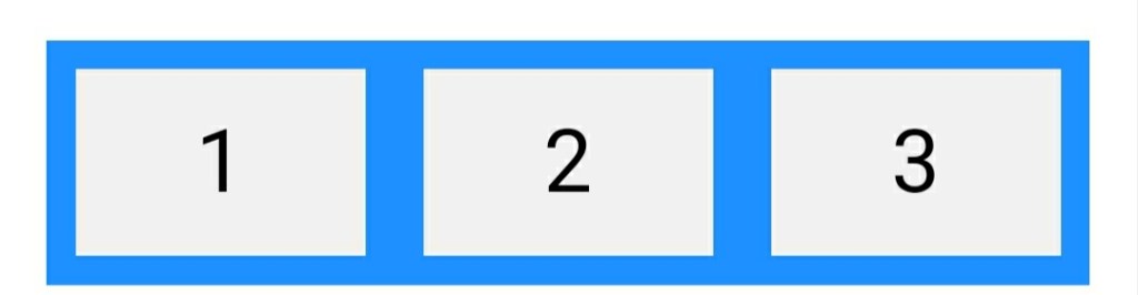
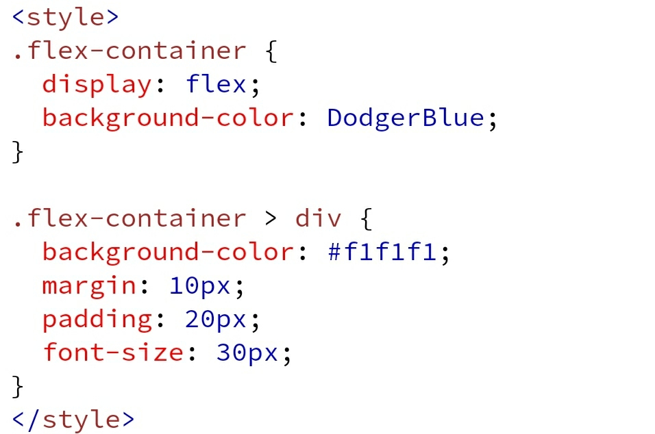
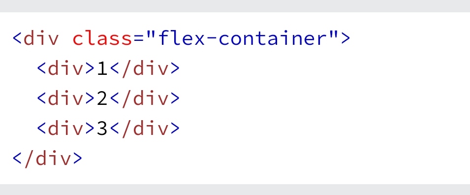
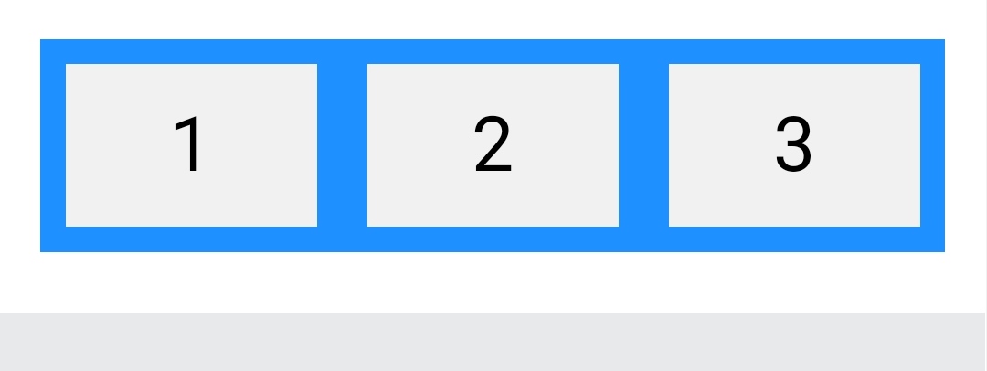
We will add the style tag in the head section and the div in body tag. And our flex container with three flex items is ready to use.
We could have use containers with rows and cols but we used flexbox to get done more from it. Let’s see some more done with flexbox.
The flex container properties are:
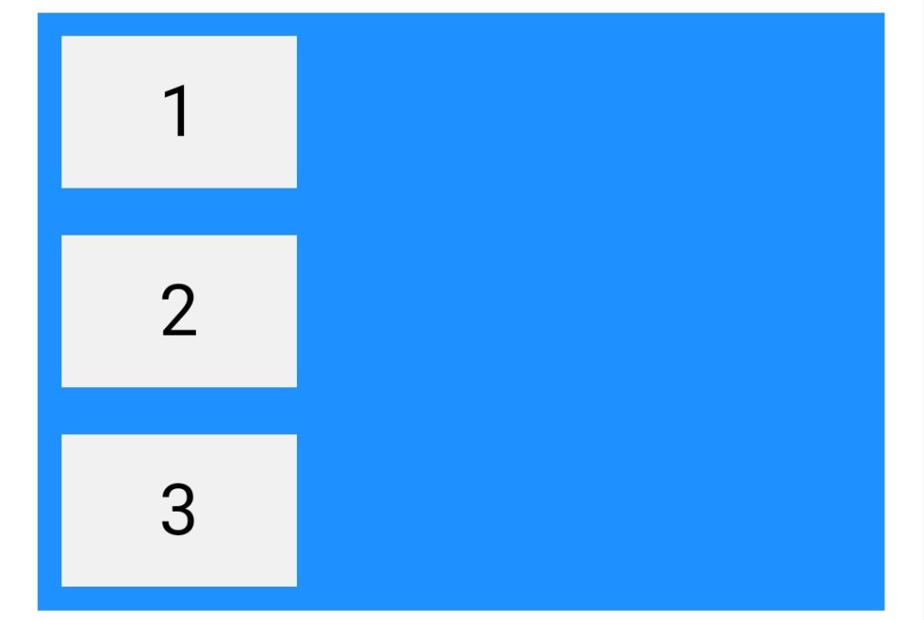
- flex-direction
flex-wrapflex-flowjustify-contentalign-itemsalign-content
 Developer Diary